When I sat down on my bed at the end of a long day at work, it wasn’t easy to bounce back again to create a style. Brain fog, sore muscles, and a headache. Yeah, not a good combo. As I began lying there in my bed, doom-scrolling through Reddit to catch up on the latest posts, I came across a post about a user trying out a fashion lookbook.
At first, I was a bit confused about the whole ‘fashion lookbook’ project. But after some research and digging around, I found the project to be quite exciting to write about on this blog. With the help of YouTube, of course!
Step 1: Creating the Title
By far, this part was one of my favorites to begin with. The title tells the story. What am I aiming for? What am I creating to make this title sound perfect?
The answer to the question, my dear readers, was given by looking on Pinterest. The site offered thousands of pins for me to choose from. Endless possibilities on where I can start. Different challenges I can plunge myself into. My artistic side was screaming in delight as the flurry of colors scrolled down my screen.
I wanted something related to Taller By Design, at the same time, having some sort of fantastical twist. A little of color there, a dash of darkness here, and then: BOOM! A title name. I was close to giving up my idea for this mini project (thanks to procrastination, scrolling through TikTok, munching on some snacks, etc), until I fell upon this photo.
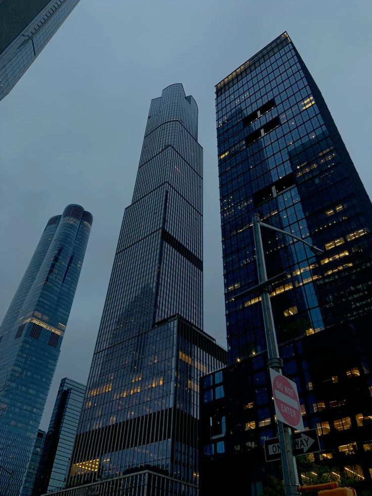
My initial thought was ‘Wow, I wonder how this photographer managed to get this shot. It must have been a perfect time of the day to look up there.’
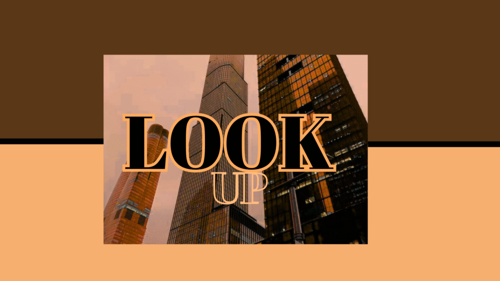
And there it was. My title for my lookbook. A simple yet strong statement that speaks about the large cities. A perfect title for my first-ever lookbook. I hopped on Canva and started editing the first page.
2. Finding the theme colors
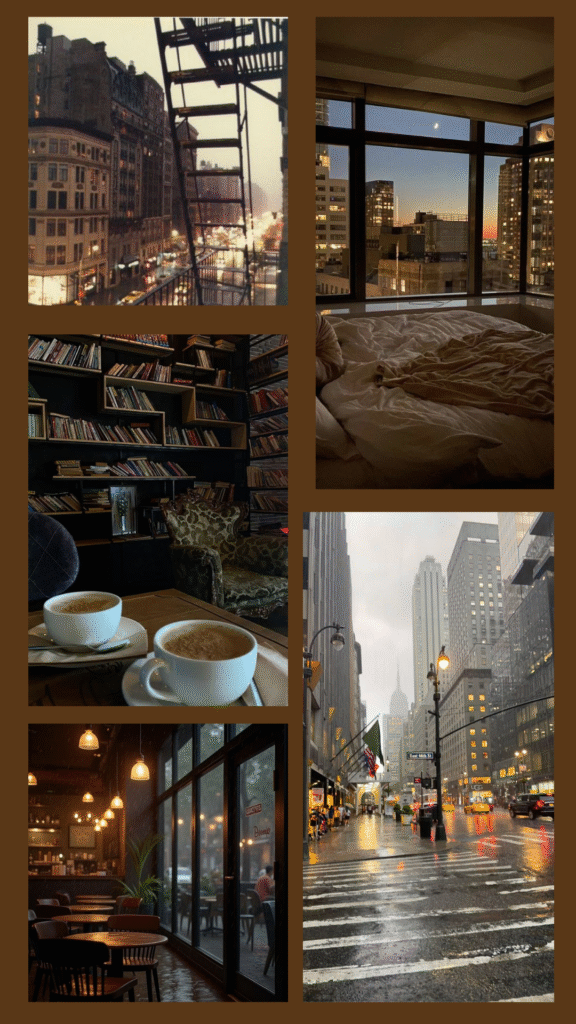
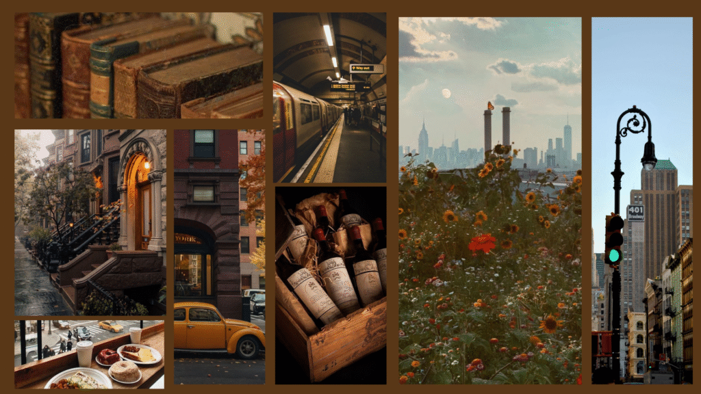
For some odd reason, I was drawn to the idea of creating an autumn-like theme for this lookbook. When I think of a color scheme in a large city like New York or Philadelphia, I think of dark, moody colors like grey, brown, or black. I do not think of one hint of bright color. To all the big city folk reading this blog, yes, I am well aware that other themes fit your base of operations. As well as the city lights during the darkness of the night.
To balance the dark theme, I added a little orange and a little beige for the tone. Giving the lookbook a cheery yet neutral look.
3. Creating the ‘Mood’
Making the mood board was the hardest part. I had the colors and title. But what pictures represent the style I want to create? I looked over the color scheme over, and over, and over, until finally an idea clicked. I decided to create two separate moodboards to help fill the inspiration void.
The first mood board I made was screaming, “Fall is here! And it’s not 100 degrees outside your window!”. But I wanted to experiment, mess with the theme. Find stickers that either go with or go against the board. I threw some coffee stains while I was at it, too!
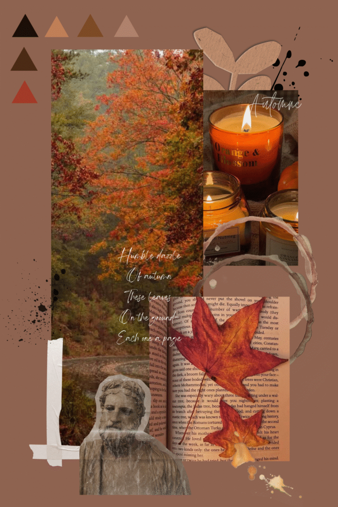
The completion of the first inspiration mood board was a great success. Also, very fun to make. Before long, I managed to make the draft version of the lookbook with the simple drag and drop from Pinterest to Canva.
The smell of coffee, the rainy day of the big city, and the old books in a bookstore shaped the mood for this project.
3. Finding the Outfits: A continued story
When I researched the remaining articles of the lookbooks, I concluded that finding the right clothes to match my lookbook. The hard part is: do I make the clothes myself or buy clothes from the store?
The idea of buying clothes from different outlets did not sound appealing to me at the slightest (it is really hard to find clothes of my length and my size). So, for this ending, dear reader, I will be writing more about my process in creating my clothes to match my lookbook.
It will be hard.
However, I am very excited to learn about making my clothes in the process. Stay tuned!